Aberdeen Art Gallery Micro Commission – How I made the prints you can still see in the city art gallery

Transformation & Anticipation at Aberdeen Art Gallery

I was recently in Aberdeen Art Gallery and was delighted to see that two of the three prints I made for them were still on show after 2 years. They’re on the 1st floor in the Oot n Aboot exhibition, which brings together pictures and stories  of local residents and their shared experience of living in the city.

Click here if you’d like to read the original Micro Commission article, which was written shortly after presenting the prints to Aberdeen Art Galleries & Museum in 2023. Click here if you’d like to read the original Micro Commission artic, which was written shortly after presenting the prints to Aberdeen Art Galleries & Museum in 2023.

Transformation (Union Terrace Gardens)(photopolymer etching)

I’ve been asked many times how I made the 3 different prints, so here is a fairly in-depth breakdown of the entire process; from my original application for the Aberdeen Art Gallery & Museums (AAGM) commission, to getting the pictures made, framed and on the wall.

Anticipation (Aberdeen Market)
The Application

I was initially told about the AAGM Micro-commissions by a studio colleague the day before the deadline. I was in the middle of moving into my new studio and packing for a New Year trip to Crovie the following day. However, as a relative newcomer to Aberdeen and having spent many hours admiring the gallery’s fantastic collection, my interest had been piqued! I downloaded the application form as soon as she left and had a first draft written within an hour.

Applicants were asked to say something about their lived experience in the city, addressing themes that might include social justice, climate change, identity, diversity, representation, well-being and migration, while responding to something that was already part of the AAGM collection. The Micro-commissions could be small in scale and created over a short time period. I thought it could be a challenge to come up with an exciting print-based project that would test some of my recently-acquired printmaking skills, especially in screen and photopolymer printing. And, in the unlikely event my proposal was successful, I might just about manage to complete the rather ambitious project I had put together in my mind, despite having already committed to 2 solo shows and another important commission – all of which were to be fulfilled before the AAGM June deadline.

So the first day of our supposedly relaxing holiday was spent rewriting my application (with considerable editorial help from my patient and very understanding partner) and it was submitted within an hour of the deadline. Then, having never applied for anything like this before, I resignedly put the whole experience down to practice and relaxed for the rest of our trip.

John Piper’s beautiful watercolour of Dunnottar Castle which was the inspiration for my own version

Around 4 weeks later, having forgotten all about my application and while frantically finishing several paintings and working on the final preparations for my early March solo show, I received an email to say my proposal had in fact been successful. My initial elation and surprise at this great news were suddenly followed by a gut-wrenching dread that I might just have overstretched myself! But I do love a challenge and that’s exactly what the following 5 months proved to be!

The Proposal

In selecting a work from the AAGM collection as an initial reference for my own project, John Piper’s powerfully atmospheric painting of Dunnottar Castle immediately sprang to mind. Like many of his works, it perfectly captures with great drama and deceptive simplicity the beauty that can often be found even in a crumbling old building. This got me thinking about how the disintegration of one thing can lead to something new and possibly even more beautiful in its place (a painting in this instance, but also the castle itself).

From here I travelled north in my mind to Aberdeen city centre and thought of the recently opened Union Terrace Gardens and how they have helped to rejuvenate that part of the city.

I then took a short trip across the road to the recently demolished Aberdeen Market and pondered how that has provided an opportunity and also some hope that something better might arise out of the dust and rubble.

One of several photo references of Dunnottar Castle for Disintegration

I decided to produce a triptych of handmade prints exploring the theme of disintegration in relation to those three well-loved local sites. To bring these ideas into fruition I wanted to use three different printmaking techniques, which would reflect the past, present and the future in their own way.

Here are some work-in-progress images and details that I hope will shed some light on the various processes used in creating each print:

Disintegration

Disintegration, the first piece in the triptych, is a traditional copper-plate etching inspired by John Piper’s painting of Dunnottar Castle.

Disintegration – copper plate etching with hard ground and aquatint (including sugar lift and spit bite) on Hahnemüle etching paper.
A line etching produced on a polished copper plate with a hard ground wax resist
A first proof pulled from the above line etching
Another proof after spit biting over aquatint

Beginning to develop areas of tone across the whole image using a combination of aquatint, sugar lift and spit bite methods. Sugar lift involves painting the aquatinted areas where tone is required with a syrupy solution – Camp Coffee in this instance – then coating the whole plate with a protective varnish. The plate is then submerged in hot water and the sugar solution ‘lifts’ off the plate and through the varnish, allowing the exposed areas only to be bitten by acid to create tone. Spit bite combines gum arabic with nitric acid which is applied directly onto those aquatinted areas with a brush. Tonal washes can now be layered up by adding more or less spit bite in a painterly, watercolour-like manner.)

The etched copper plate and a proof taken at this stage of development.
Inking up the plate
Holding up the final print, ready for editioning
Transformation
Transformation – Photopolymer etching with chine collé and watercolour on calendered Hahnemüle etching paper

The middle piece, Transformation, depicts Union Terrace Gardens and contrasts old and new features now present in the gardens and also in the method used to create the print; in that it combines ancient etching techniques alongside photography.

(‘Calendering’ involves running the paper through an etching press under a steel plate in order to flatten out an irregular or rough surface. This results in a smoother, more photographic final image when printed using this method. Other papers could have been used, but, as this is part of a triptych, it was important to maintain continuity of tone and colour. Using the same paper for all three prints helped with that.)

A cropped photo I took with my drone that would be used to produce a photopolymer plate
The above image required further editing in Photoshop – spot the difference!
The final image is printed onto acetate to produce a film positive when exposed under UV light onto a photosensitive film, which in turn has been adhered to a plastic or steel plate.
After developing the film, it can hardened outside in natural UV light from the sun.

This was an early failed attempt using plastic as a support for the film. I used steel in the successful print which holds the film better and is more robust during the inking and printing stages.

Inking up the plate

Chine collé (a technique using coloured tissue which is sandwiched between the ink and the support paper) cut to shape and added to colour the base of the podium and the circular pendant light. The poles were hand finished with watercolour.

Chine collé paper is glued and in place prior to positioning the support paper on top before it is all run through the press. The pressure will adhere the tissue (glue side up) onto the support paper and the ink will be printed from underneath onto both surfaces.

The steel plate used as a support for the photosensitive film was cut to be slightly larger than the final image, creating a debossed ‘frame’.

The print is signed and ready to frame for the Aberdeen Art Galleries & Museums collection
Anticipation
Anticipation – Screen print on calendered Hahnemüle etching paper

Anticipation focuses on the Aberdeen Market area and poses the question: what does the future hold for this site? The imagery for this three-colour screen print was created entirely in Photoshop.

Drone photo of the old Aberdeen Market site used for the background image of the third print in the triptych.

Photoshop was used to combine a drone-captured digital image with an interpretation of the Herakut mural from the old Aberdeen Market. Three colour separations were then produced: one combining the main background image and the Old Market mural and one each for the gold question mark and the silver Aberdeen Market text.

Manipulating a photograph of the old Aberdeen Market in Photoshop. Note the removal of the lighthouse and how the hand is now upturned to hold the question mark.

After editing the background, I combined a ‘ghost’ image of the girl and old market along with the gold question mark and text in layers to create 3 colour separations to produce the screens for printing the final piece. In the end I decided to hand-paint the question mark screen separation as I wasn’t satisfied with any of the fonts I tried, including the one seen above.

Screen printed proof combining the original background image with the girl/old market and printed in one colour.
Another proof incorporating the hand-painted golden question mark

Testing different colours of ink for the Aberdeen Market text. Silver foil and glitter were also tried at this stage, but I went with a silvery grey to reflect Aberdeen as the Silver City.

The final image is signed and ready to frame for Aberdeen Art Galleries & Museums
The Micro Commission Experience

Working on the AAGM Micro-commission has been a fantastic experience as well as a great opportunity to learn. Not only because it has allowed me to develop and test my skills in traditional and photopolymer etching, as well as screen printing, but the funding that was provided by the Friends of Aberdeen Art Gallery and Museums has also enabled me to produce an entirely new stand-alone series of prints that are quite different from anything I have done before. It is also wonderful to know that my triptych has been accessioned into the AAGM permanent collection.

I would advise anyone who is interested in applying to the next round of Micro-commissions to absolutely go for it. This has been a hugely rewarding experience and has shown me what I can achieve under intense pressure.

At the Aberdeen Art Galleries and Museums Treasure Hub where I gave a talk about my Micro Commission work to the Friends of AAGM
And finally …

Finally, I would like to say a huge THANK YOU once again to the Friends of Aberdeen Art Gallery and Museums for providing the £2500 funding that enabled my Micro Commission, and many thanks also to Shona Elliot and all the staff at AAGM for their excellent support throughout. I’d also like to thank the staff at Peacock Print Studio and, in particular, James Vaas and Struan Hamilton who have both been very generous with their time, patience and expertise throughout this process.

An Artistic Journey with the Northern Lighthouse Board (NLB)

Getting ready to step inside 84 George Street to discuss a potential commission with the NLB Commissioners.
A Commission from the Commissioners

Back in early 2024, I slipped a simple flyer through the doors of the Northern Lighthouse Board’s Edinburgh headquarters, affectionately known as 84 George Street by those who work there. It was an invitation to a talk for my upcoming solo exhibition, Northern Lights — a collection celebrating the beauty, history, and resilience of Scotland’s lighthouses.

I had no idea that this small act would lead to one of the most meaningful commissions of my career.

A few weeks later, CEO Mike Bullock and Heritage Trust chair Alastair Beveridge attended my gallery talk. During the event, I shared the story of an earlier architectural commission for Strathberry Ltd. When I unrolled a full-size print of that painting, it caught their eye. Alastair even bought the print on the spot!

Not long after, they invited me to discuss creating a bespoke painting of their George Street headquarters — a building steeped in history and purpose.

The Strathberry HQ painting that caught the attention of the NLB team during my talk.
Stepping Inside 84 George Street

Walking into the NLB’s HQ is like stepping into a hidden world. From the elegant Georgian exterior, you’d never guess just how vast and intricate the interior is. Room after room tells a story, many filled with antique furniture and commissioned artworks that span more than 250 years of maritime history.

It’s not just a building — it’s the operational nerve centre for every lighthouse in Scotland and the Isle of Man, a place where history and innovation coexist.

A hidden world inside — where heritage and innovation meet to keep Scotland’s lighthouses shining.
Bringing the Vision to Life

For a building and commission like this, getting the perspective right was crucial. Using my drone, I captured images from multiple angles, ensuring I could represent everything — from the roofline to the subtle details of the lower levels — without distortion.

Finished pen-and-ink outline ready for approval before painting began.

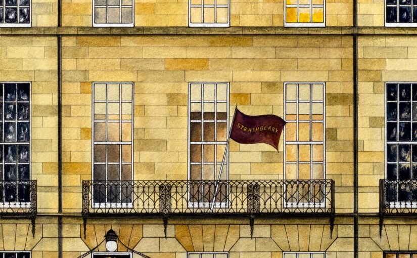
Some of my favourite touches include the subtle flash of the Bell Rock lighthouse decoration, glowing in the night sky, and the gold leaf accents used to portray the brass door furnishings. The deep blue evening sky contrasts beautifully with the warm sienna tones of the stonework. And then there were the flags — trickier to paint than they look — which needed to be clear and recognisable while still looking as though they were naturally blowing in the wind.

The Bell Rock lighthouse detail above the doorway — in my painting, it flashes every five seconds, just like the real thing.
The Finished Painting
The completed painting, with warm sienna tones and deep evening blues capturing the atmosphere of the building at night.

It took about four weeks to complete the painting, with a few much-needed sanity breaks along the way! Getting the geometry of the paving slabs right was also a challenge, but a rainy day in Edinburgh gave me great reference photos — the wet stones reflected the light perfectly, adding depth and richness to the foreground of the piece.

The final painting captures what I hoped for: a sense of atmosphere and purpose, where architectural beauty meets the vital work of the NLB in guiding mariners safely home.

Handover day — Alastair Beveridge (left), me, and Mike Bullock (right) outside the NLB headquarters.
A Personal Milestone Achieved on Handover

This commission wasn’t just another art project; it was the fulfilment of a lifelong ambition to work with the Northern Lighthouse Board.

As someone who grew up in Arbroath, watching the Bell Rock lighthouse flash every night from my bedroom window, and who has long been fascinated by Scotland’s lighthouses — thanks in part to Bella Bathurst’s The Lighthouse Stevensons — this collaboration felt like everything coming full circle.

Handing the painting over to Mike and Alastair was a proud and humbling moment. I’m delighted with how the painting turned out, and even happier that the team at the NLB felt the same when I delivered it personally to 84 George Street.

A Proud Moment

I recently returned to NLB HQ and was genuinely moved to see my painting hanging just inside the main entrance. It’s a little surreal to know that my work has now become part of the building’s story.

My painting hanging proudly just inside the entrance at 84 George Street.

The moment was topped off when I opened the Summer 2025 edition of the NLB Journal and spotted a feature about the painting and its handover. Several staff members have since ordered prints — some to be given as retirement gifts for NLB staff — a gesture that feels like the highest compliment an artist can receive.

The Summer 2025 edition of the NLB Journal featuring my painting and its handover.
Prints Now Available

If you’re as obsessed with lighthouses as I am and would like to have a beautiful Giclee print of the Northern Lighthouse Board’s Edinburgh HQ, just send me an email at: cliveramage@gmail.com and we can arrange for one to be sent out to you.

Next Up

I’ll be sharing another post soon, showing the step-by-step process of how this painting came to life — from initial sketches to the final framed piece — so keep an eye out for that update.

Strathberry Commission

Just in time for Christmas and after several months in the making, I am delighted to share some very exciting news about recent work I have been doing for top Scottish luxury leather goods brand Strathberry.

Strathberry HQ Christmas animation

For those of you who don’t know, Strathberry is based in Edinburgh’s West End and has a retail outlet in the city’s Multrees Walk, along with 3 stunning boutiques in London’s Covent Garden, Kings Road and Burlington Arcade.
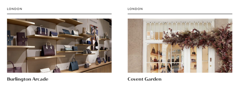
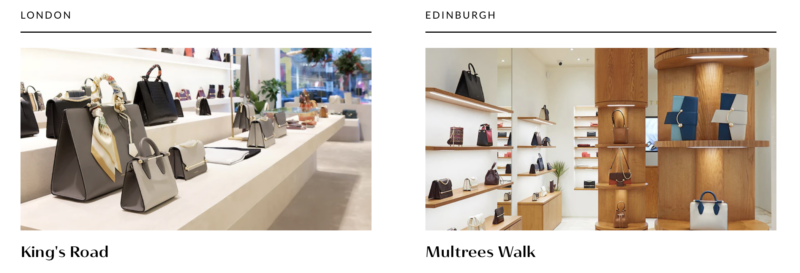
Strathberry’s four stores around the country

They are internationally renowned for producing high quality, beautifully hand-crafted handbags and are the go-to brand for the likes of Kate Middleton and Meghan Markle according to Marie Claire.
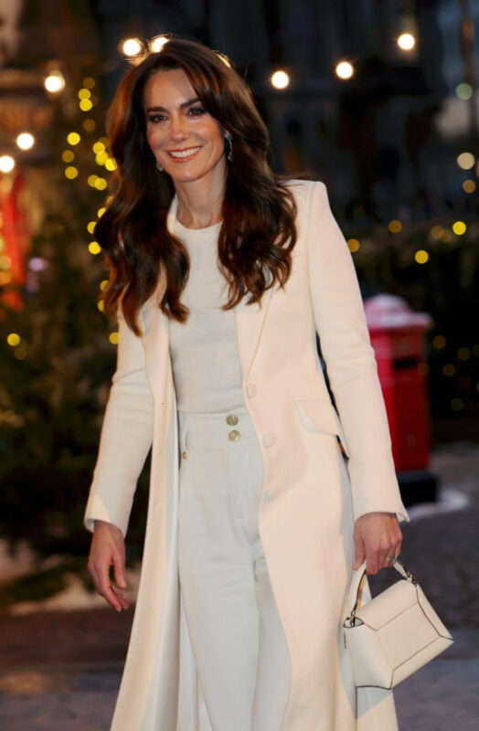
The Princess of Wales loves Strathberry
The Commission

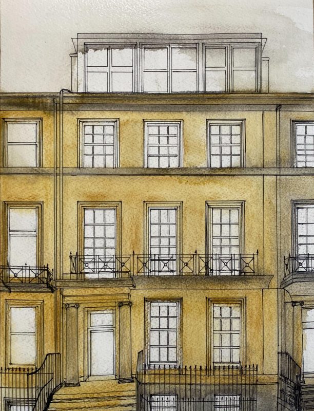
It was just over a year ago that I was approached by Amber, Chief Marketing Officer at Strathberry, in a particularly serendipitous twist of fate. The company was about to celebrate its 10th anniversary and wished to use their stunning 4 storey Georgian townhouse, in Edinburgh’s Melville Street, as the new face of the brand. She had googled ‘Edinburgh artist’ and, as a result of that search, came across a previous blog post of mine where I had detailed the various stages towards completion of a commission I had recently done of a similar townhouse in the city’s Rutland Square (see that image below and click here to read that post).
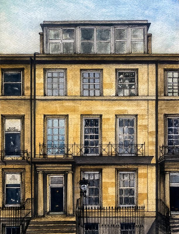
Rutland Square Commission

Impressed by the end results of that project and looking for something similar but uniquely ‘Strathberry’, they commissioned me to produce a detailed ink drawing of their HQ. The brief was not only to create something that was representative but something that could also be utilised in a variety of novel ways going forward: for example, an image that might be flexible enough to appear on packaging, tissue paper and product care booklets, as well as being featured in a variety of media online and in print.
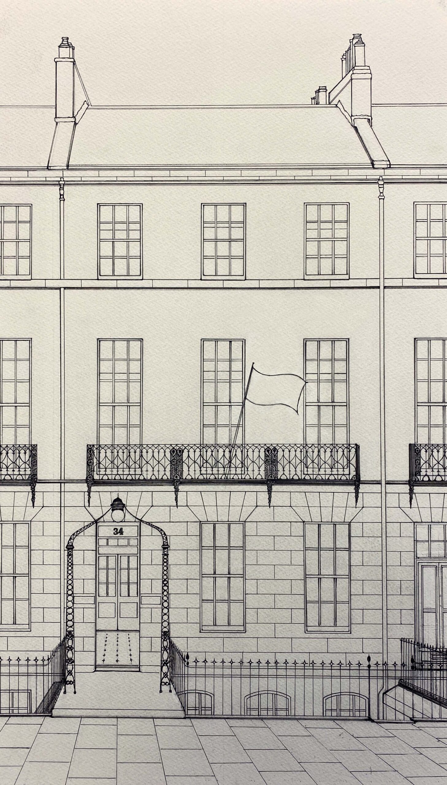
The final Strathberry HQ drawing before adding colour

With all of that in mind, I created the image above – deceptively simple in design and finish, but far from simple to produce. In order to fit the whole building into the frame (including the roof and chimneys as well as the basement) I had to somehow show it from mid height (I used a drone to get a variety of photos at different heights for this purpose). However, this created its own problems in that a bird’s eye perspective had the effect of warping the entire image, revealing too much basement  and moving the focal point away from what I hoped would be a welcoming doorway that would lead the viewers into the building – so to speak.

In the end, and after a couple of time consuming false starts, I managed to compose an image which shows the entire building without warping the perspective at all, while giving equal prominence to every storey (roof and basement too) but maintaining the entrance way as the main focal point. I submitted my final ink drawing in April and, thankfully, Strathberry owners Guy and Leanne were delighted with the result.

Now it was time to paint the townhouse (see below)!
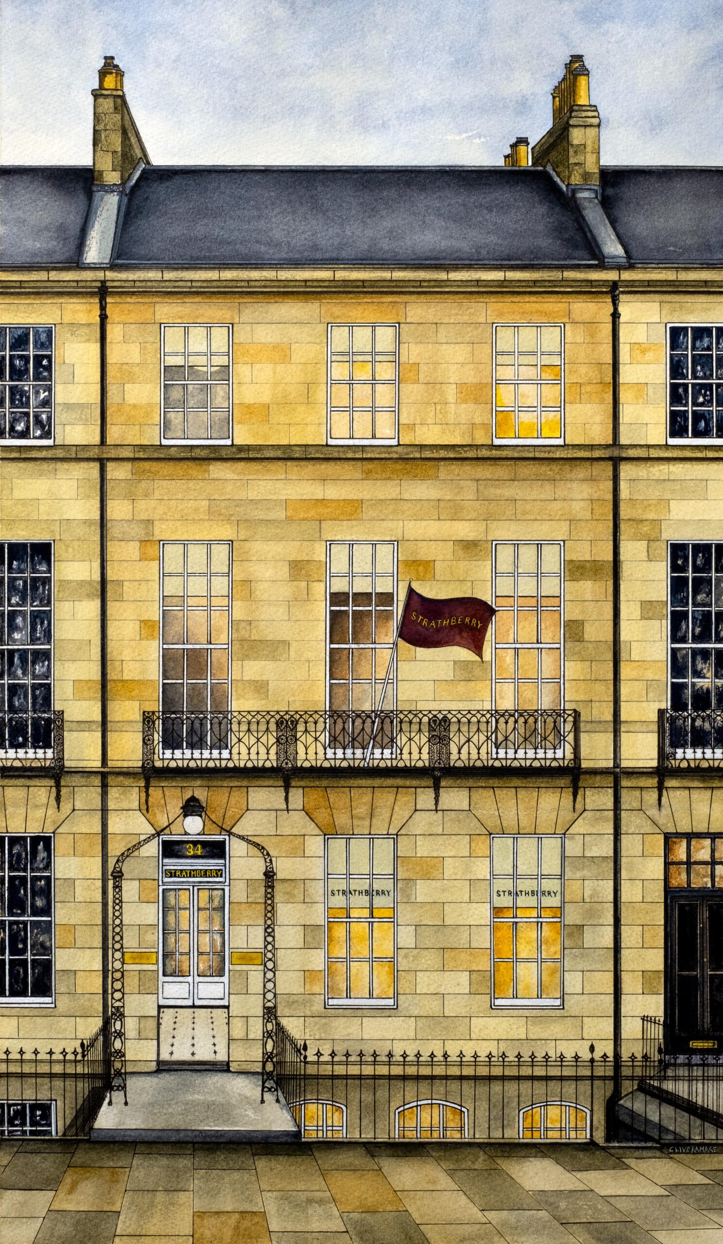
The Strathberry Townhouse

Again, I wanted to keep the painting as simple but effective as possible, while showing the Strathberry townhouse at its very best. 34 Melville Street, Edinburgh is not only the company HQ, but it’s also the place where products are designed and marketed (as shown to great effect in the magical Christmas animation above). It also happens to house a sumptuous showroom on the ground floor. All in all, Strathberry HQ is an extremely elegant Edinburgh townhouse – sophisticated, yet warm and welcoming – and I hope to have created something that reflects those qualities with these images.

Commissions are never straight forward or relaxed affairs but, much to my relief, Guy and Leanne were again delighted with the final painting, which I delivered in June (see handover picture below).
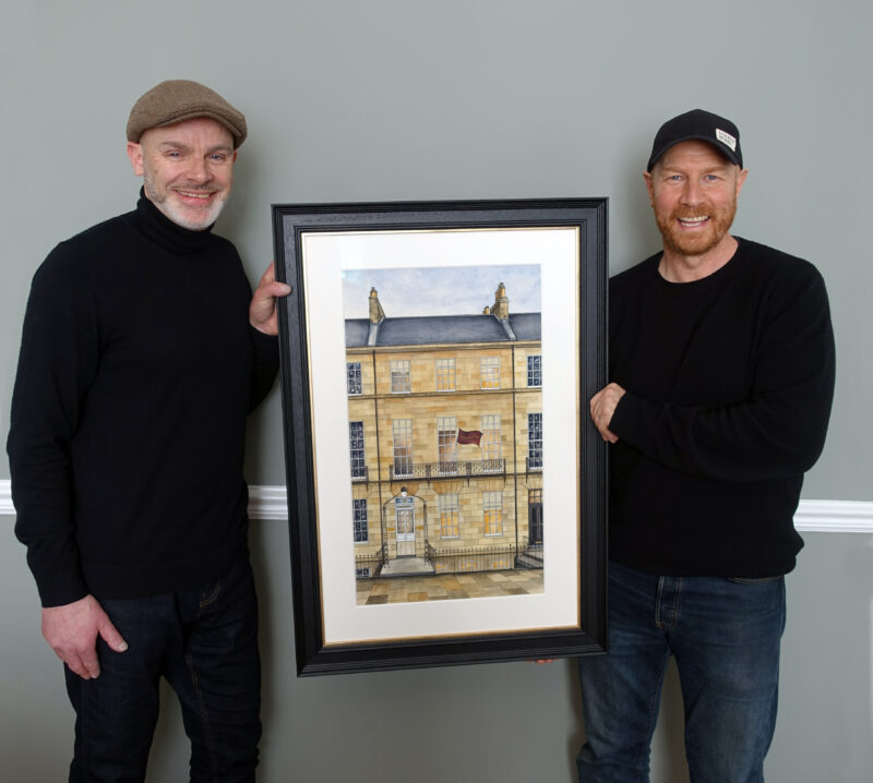
Handing over the finished painting to Strathberry owner Guy Hundleby

I’ll post a more detailed account of the whole procedure in a future blog piece, including a stage by stage breakdown of the creative process involved. But for now I just wanted to show the final images produced for this prestigious commission and give a little more information about how Strathberry have been using my images to help celebrate their 10th anniversary and also to showcase their stunning World Heritage listed HQ.
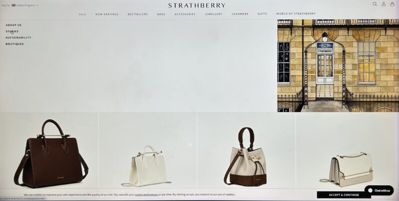
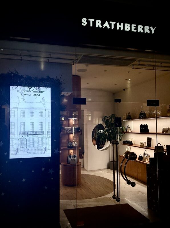
A detail of the painting pops up when hovering over Strathberry Stories on the company website
An animated version for Christmas in Strathberry’s Multrees Walk Store, Edinburgh
The beautifully animated version has been on show on window display screens in every Strathberry boutique in the land

And and how’s this for a bit of unashamed name dropping … ? I was recently informed that ex US president Bill Clinton, while on a shopping trip to London, was entranced by the animation while walking through the Burlington Arcade store. So much so that after watching the whole clip he was enticed into the store and purchased 4 handbags for Hilary and Chelsea!

Strathberry have also used an inverted version of the ink drawing on menus for a recent press event at the Kimpton Hotel in Edinburgh.
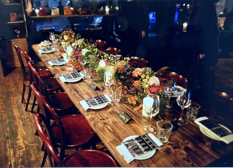
Menus featuring an inverted version of the image

The Strathberry story will continue to develop over coming years and I am very excited to see how the image I created for the company will be utilised in exciting new ways going forward.

In the meantime, I hope to do more of this kind of work in future. So if you are looking for a similar (but different!) picture of your own elegant townhouse, or anywhere else for that matter, and would like to discuss how to make that happen, then please do not hesitate to get in touch via the contact page or by emailing me at: cliveramage@gmail.com
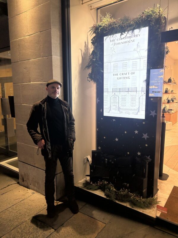
Proud and delighted to see my work being used in such a wonderfully creative way this Christmas!

Wishing you a very Merry Christmas and a prosperous and Happy New Year!
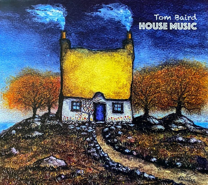
House Music, a new album by Tom Baird

House Music by Tom Baird

I’m delighted to have one of my pieces used as the cover art for a fantastic new album by Scottish musician Tom Baird.

Tom got in touch with me last November, having spotted some of my work in a Facebook post by Braemar Gallery. At that point he was just finishing off the recordings and was looking for something different for the cover that would help illustrate the overall feel of his collection of new songs.

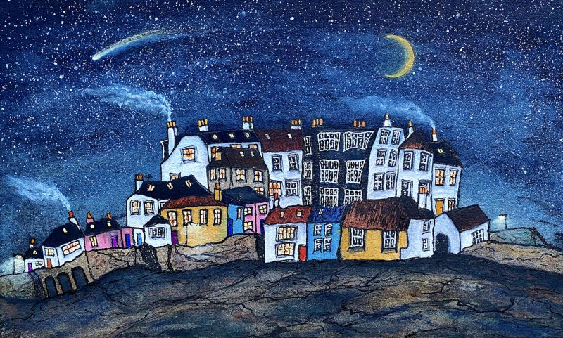
He particularly liked my Little Cottage series and East Neuk pictures and thought one of them would make a good cover. The album’s working title at this point was This Old Town, the name of one of the tunes, and he initially considered the East Neuk (Shooting Star) picture below for that.

East Neuk (Shooting Star)

But in the end it became House Music (Tom has a home recording studio and did all the work on the album there) and so it seemed a perfect fit to have one of my Little Cottage pictures to illustrate that. He felt Autumn Bothy By The Sea stood out because the yellow roof against the blue sky was particularly striking and, I have to say, I’m delighted with the final result!

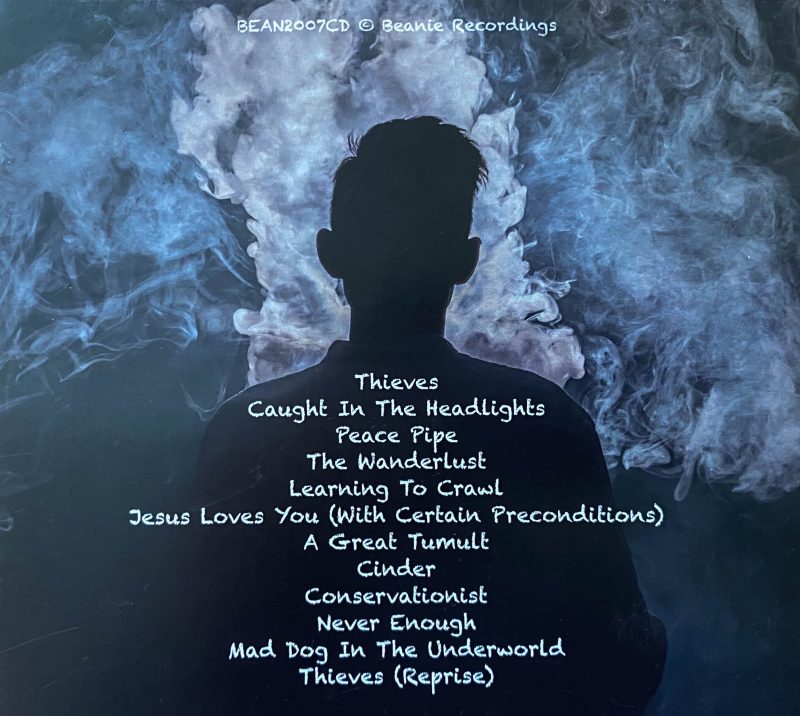
House Music album back

The album has 12 great songs, all brilliantly written, performed and produced by Tom. It won’t be out until 10th June, but he kindly gave me a few copies and I’ve had it on repeat since getting it. I’ve been very impressed by the diversity and quality of all the album tracks, but my current favourite is the new single Peace Pipe. It’s short and snappy and a real belter of a tune, with a few surprising twists and turns in the music and also the philosophical (with a large dose of irony!) lyrics too. Several of Tom’s songs have been played regularly by Steve Lamacq on BBC 6 Music and on Radio Scotland and you can hear Peace Pipe and lots of his other excellent releases right now on Spotify.

I always fancied doing a book or an album cover so what an absolute privilege to have one of my pictures on the front of this great album by a very talanted songwriter!

Find out more about Tom and have a listen to his great music yourself by clicking the links below:

Tom Baird Bandcamp

Rutland Square, Edinburgh – A Commission

Commissions are not something I’ve done a lot of in the past. It’s not that I haven’t been asked, but more that I’ve felt the burden of meeting a client’s expectations a little overwhelming. I think I really just convinced myself over the years that I prefer to do my own thing, which really translates as wishing to remain steadfastly in my comfort zone of doing what I like for myself because … well, there’s no good reason at all!

So when I was asked if I’d be interested in producing a painting of a rather nice block of flats in Edinburgh’s Rutland Square I deliberated for a moment, before deciding it was time to bite the bullet and take up the challenge.

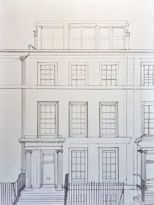
Stage 1.

Initial pencil drawing on Saunders Waterford 425 gsm rough watercolour paper.

It’s always great to hear how new clients come to find my work and it transpired that this time it came down to a good old Google search for “Edinburgh art”. Quite a few of my paintings came up and that was enough to persuade the client to get in touch.

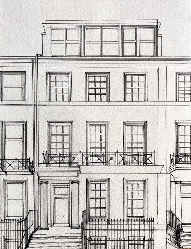
Stage 2.

I then drew over the main pencil lines in permanent ink.

Of course, I do like to draw and paint subjects that interest me and, happily, I liked the building in question and was delighted to have been asked. It’s a lovely compliment, after all, to be commissioned to provide a present for a very special person who will hopefully be able to cherish it for years to come! And it goes without saying that the payment is always most welcome too!

So here are the rest of the stages towards completion …

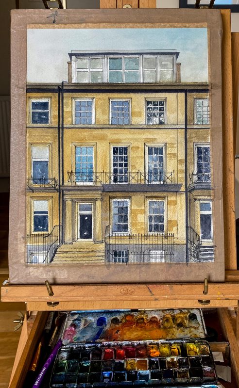
Stage 3.

Initial watercolour washes. The paper was still wet when I took this photo, hence the slightly wobbly look. 425 gsm paper is very thick and doesn’t really need to be stretched. It will ruckle up a little bit with the application of water, but then dry perfectly flat again.

Stage 4.

More washes added to the building and the window panes blocked in. It’s starting to take shape.

Stage 5

Feeling quite happy with the results so far, but knowing there’s still a lot of work to be done on the details front. I’m not sure why there’s a large puddle of bright orange in my palette as it’s not a colour I used in this picture.

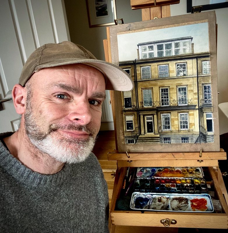
Stage 6.

The finished piece. I have to admit that I really enjoyed working on this over the past few days and, having overcome my reluctance to take on commissions, I very much look forward to doing more of them.

If you like what you see here and wish to commission something personal for yourself (or someone very special) then please feel free to get in touch and we can hopefully make it happen!